Jet Oil Tools
Web Design: JetOilTools.com
Completely new website design, re-mastering of existing logo and design of alternate styles, design of flyers / leave-behinds.
Working in close collaboration with our client, we created an all-new and fully responsive website which works equally as well on a small smartphone screen as it does on a laptop or large computer screen. Limited digital / print collateral was designed to give a more polished appearance to Jet Oil Tools’ leave-behinds for sales meetings and trade shows.
The pre-existing logo was refined, vectorized for scalability, alternate styles were created for various uses, and new high-resolution source files were created. Careful attention was paid to branding styles and logo elements through the website, with minimal use of color with the exception of “Jet Red” for important call-outs and calls-to-action.
Incorporated customer reviews and testimonials throughout the website to assist in trust-building, clearly communicated value through quantitive data in attention-grabbing animated elements and detailed case studies, and implemented multiple points for calls to action.
Home page for JetOilTools.com with animated branding elements.
About page for JeOilTools.com with animate branding elements and important call-outs.
Example of a leave-behind flyer / spec sheet for the Jet Oil Tools Flare Frac Plug.
TxMLC
Web Design: TxMLC.com
Complete re-design of website.
Fully responsive website design which looks great on all displays, whether a tiny phone screen, laptop, or large computer screen.
Thoughtful implementation of key value proposition points, trust-building through multiple integrations and stylings of customer testimonials, and multiple calls to action utilizing brand colors to help turn web visitors into clients.
Home page of TxMLC.com
About page of TxMLC.com
Press page of TxMLC.com
Contact page of TxMLC.com
FinTech Client
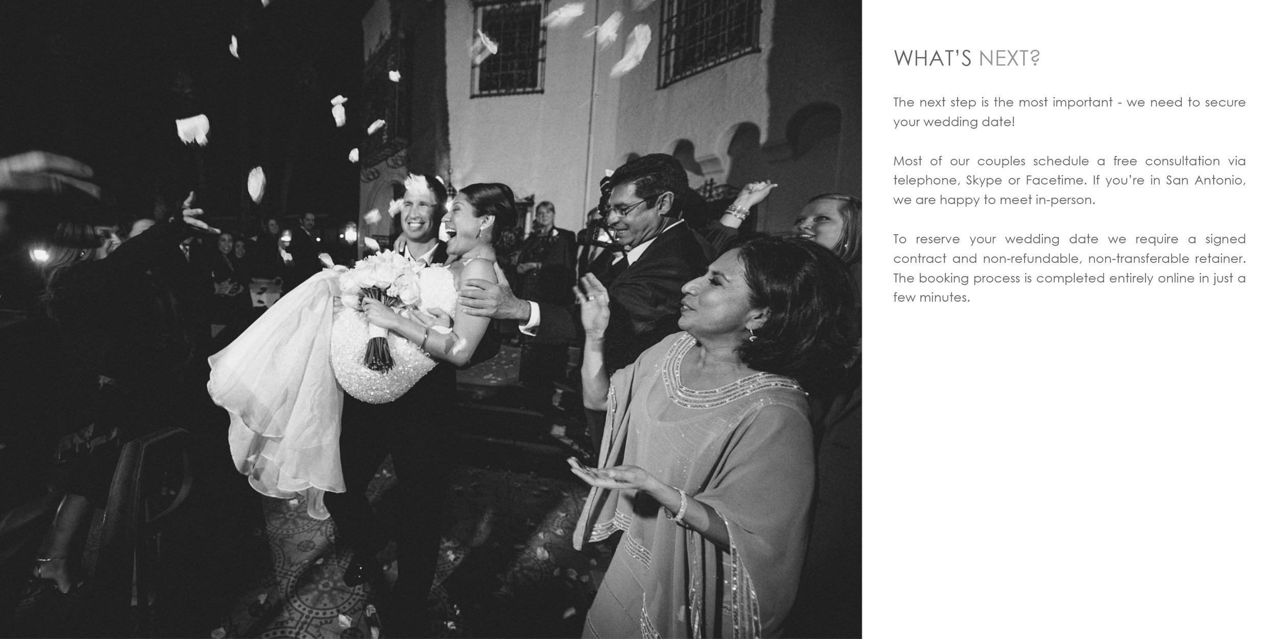
I was tasked with helping the digital team at a Texas financial institution track down the root of a problem they were having trouble pinpointing. After initial attempts to reproduce failures were unsuccessful, I turned to careful analysis of process flows and business rules and conducted interviews with relevant subject matter experts in-house and with connected 3rd parties to fill knowledge gaps, refine documentation, and target likely failure points. This process improvement project was completed in a total of 8 weeks (2 weeks of exploration, 4 weeks of 3rd party development, 1 week of internal testing, 1 week release scheduled).
Mobile Deposits Failures Improvement Project
Haute Chef TX
Web Design: HauteChefTX.com
Logo and brand design for private chef specializing in intimate events with luxurious custom-crafted menus. Designed and sourced custom physical laser-cut menus and printed inserts. Collaborated with chef on the plating design for each course. Designed and created a set of custom hardwood trays out of soft maple with routed inlays to perfectly hold square bento-style bowls after we were unable to find an existing option for the plating design for the “Lobster + Scallop” course.
While the website is HauteChefTX.com, we also registered HotChefTX.com which forwards to the correct URL, in case of spelling errors.
[2021] Logo, branding, uniform design, promotional video and collaboration with chef on plating for 5-course meal.

Overview of place setting with custom menus and printed inserts.

Cork coasters with Haute Chef logo, close-up of custom wooden menu and printed insert + laser cut name for place setting.

Custom wooden serving trays with square bento bowls for first course.

Plating design collaboration with chef for amuse bouche.
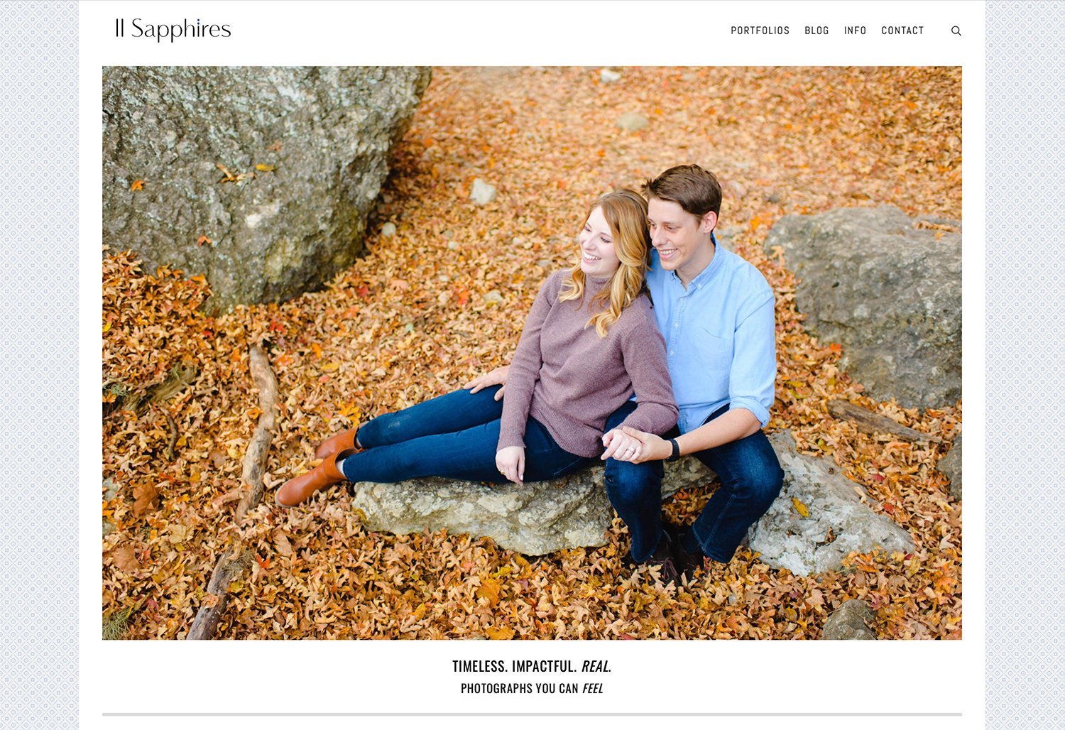
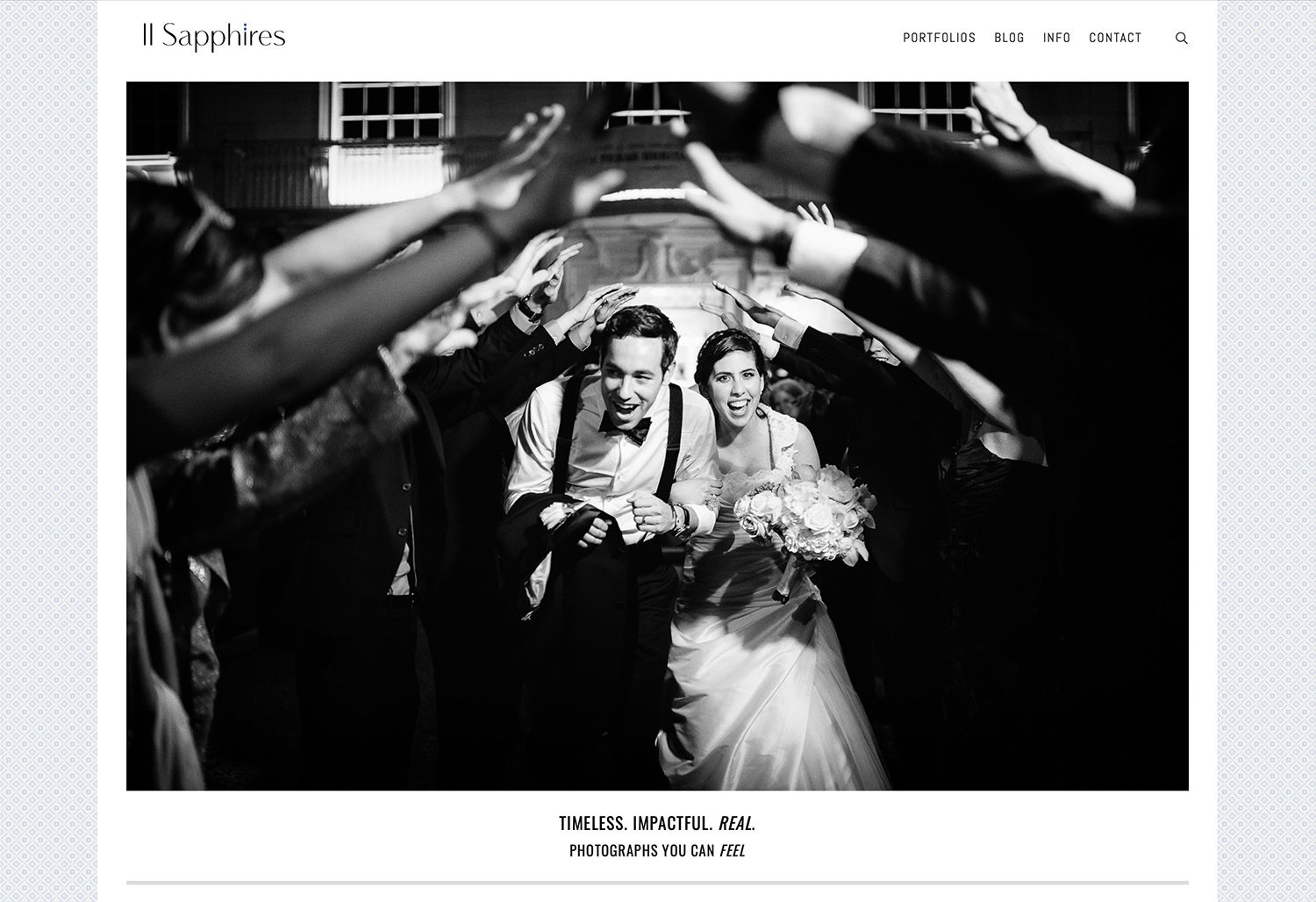
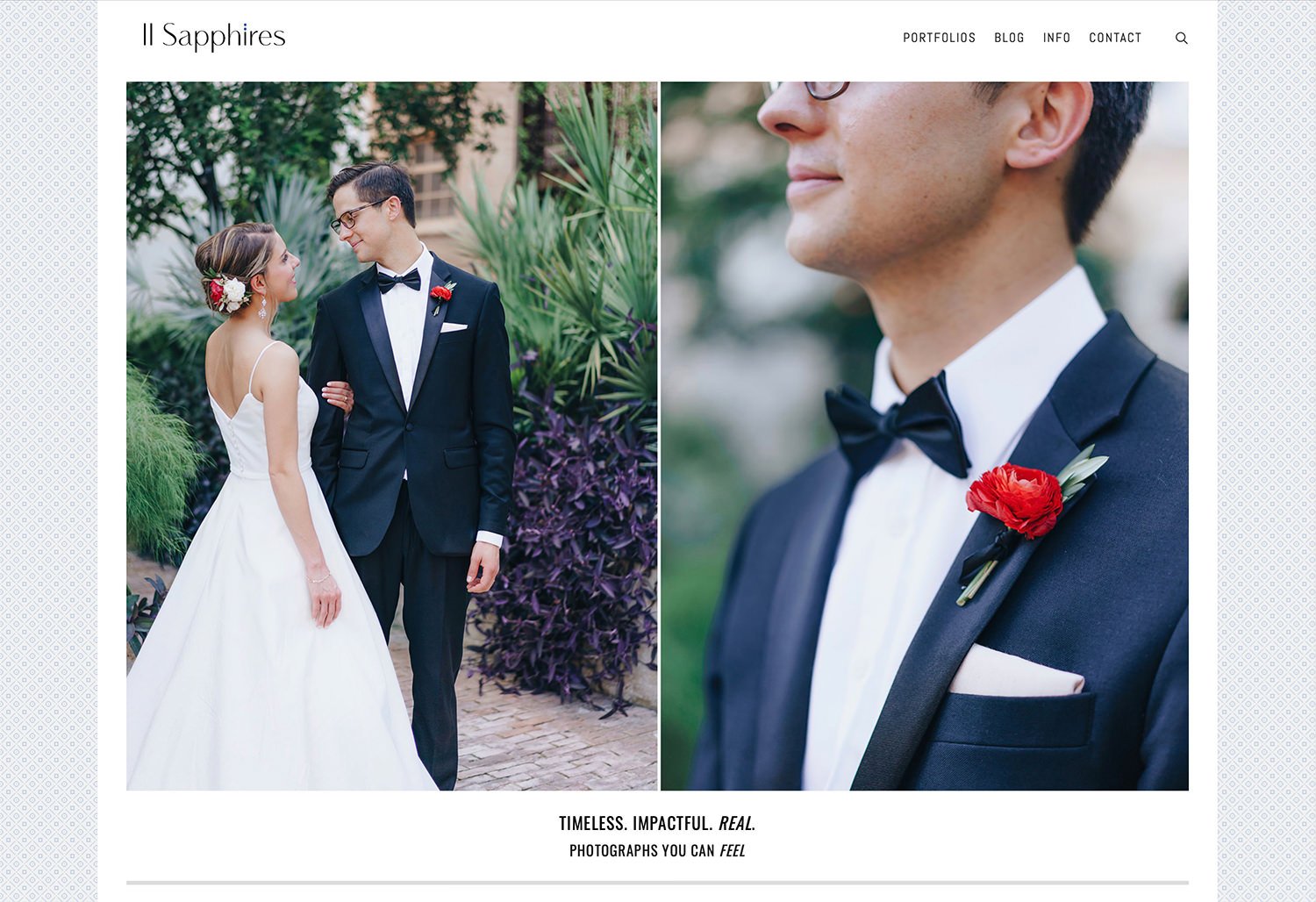
Two Sapphires
Graphic & Web Design: TwoSapphires.com
Complete design services from conception to completion, including production of collateral. Logo, branding, web, graphic and product design for husband/wife photography duo.
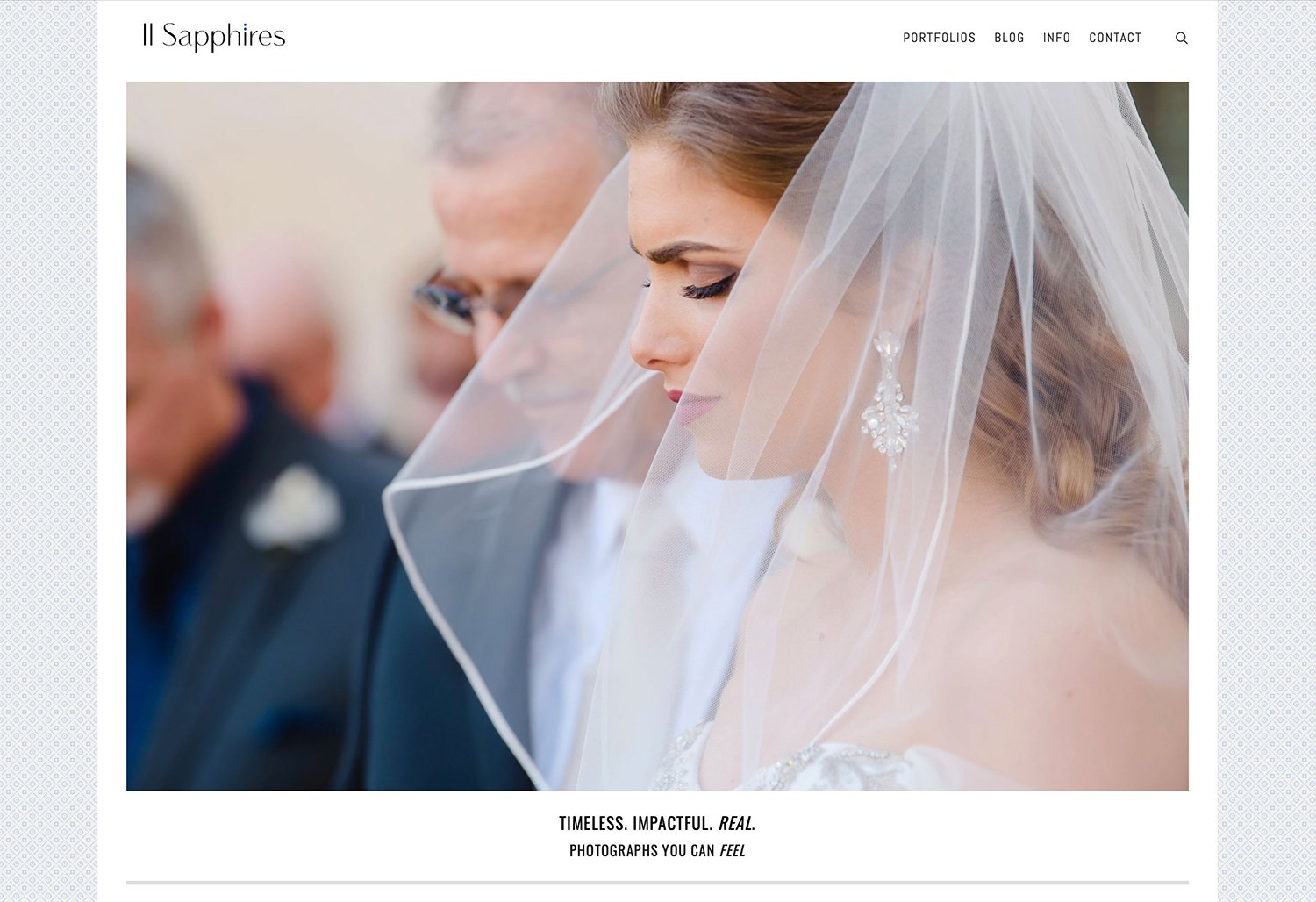
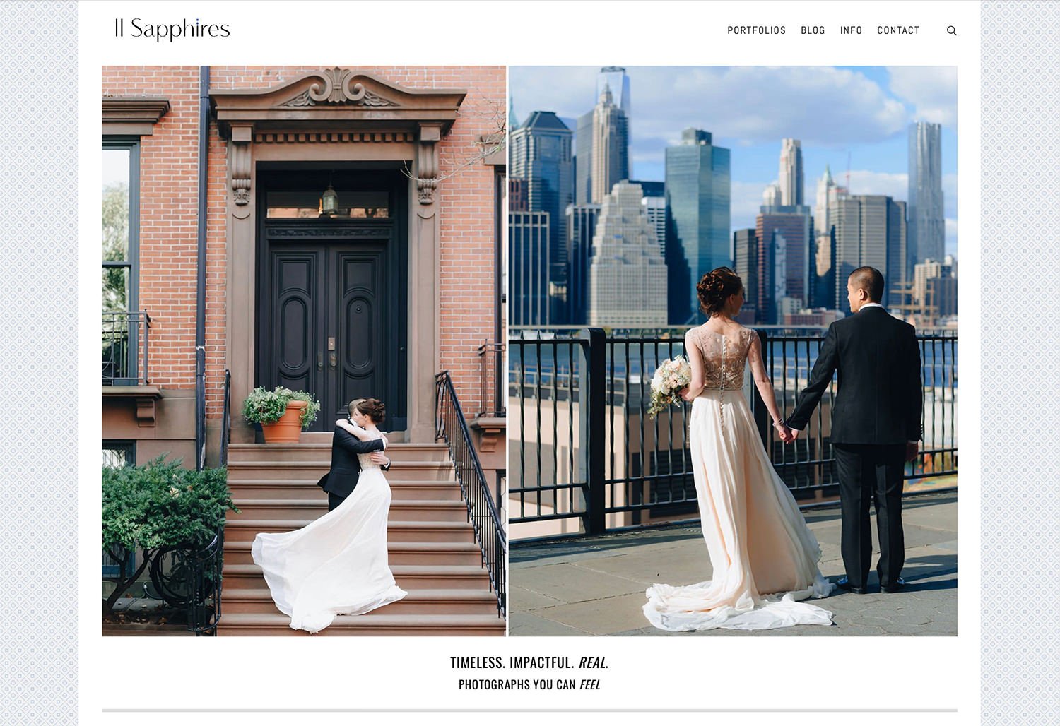
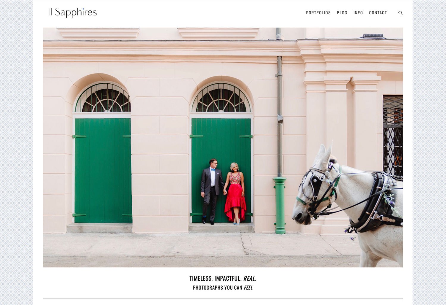
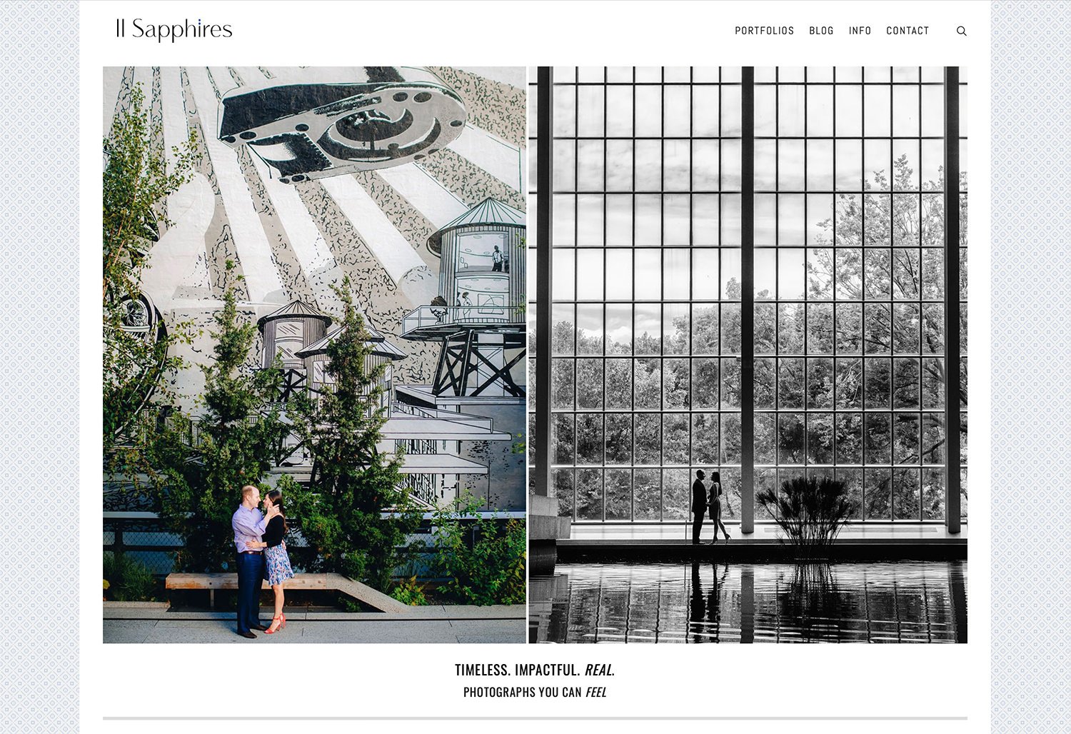
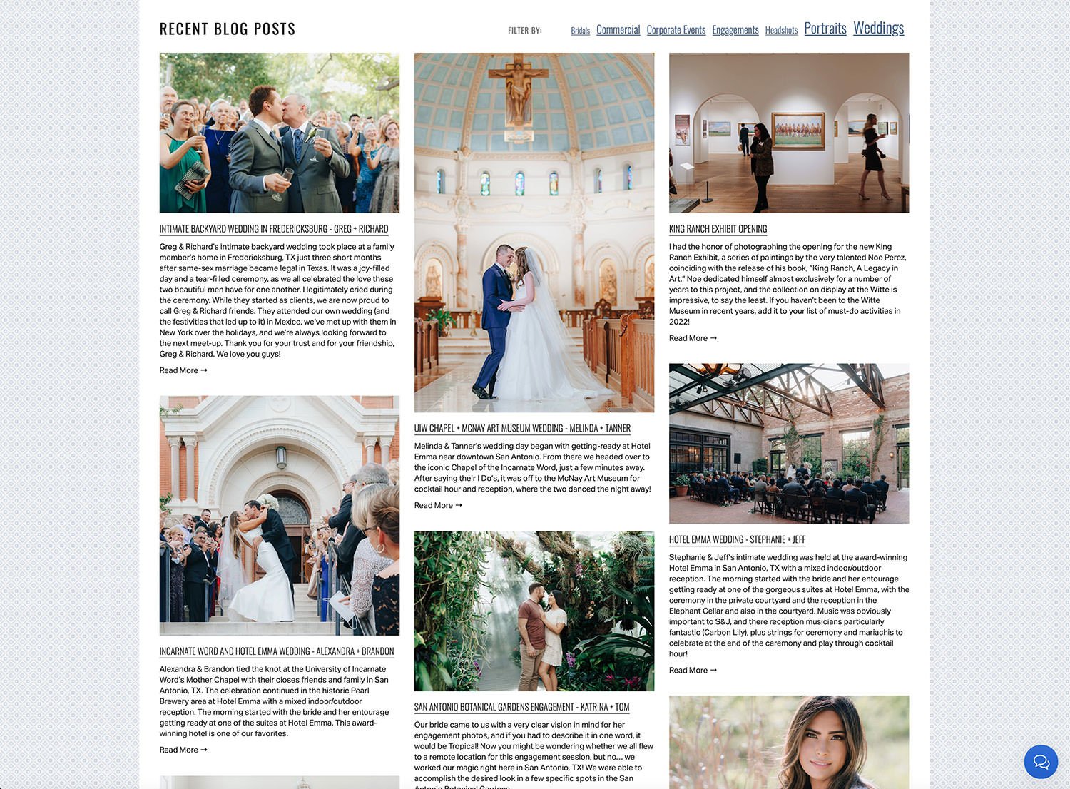
As you scroll down the home page on TwoSapphires.com, recent blog posts are shown along with the option to filter by common categories, allowing prospective clients another means of quickly reaching the content they are looking for, in addition to the portfolios drop-down menu at the top of the page. It was important to be able to show a large body of high caliber work all in one place to communicate the value of hiring this expert duo for any of your photography needs. In the bottom right corner of every page there is a persistent Live Chat function, which offers another sense of security and professionalism.
[2018] Logo design for Two Sapphires. The decision was made to simplify the roman numerals for the number ‘2’ despite it being a potentially confusing pronunciation, since the website URL is ‘TwoSapphires.com’ because the couple wanted sleek and modern lines with a luxurious brand appeal, and sometimes (not usually) form wins over function. Above the ‘I’ there are two blue dots which represent sapphires, their namesake and an important part of the brand story.

Minimalist square double-thick business cards with gilded edges, for a luxurious look and feel that leaves an impression.

Multi-design pack of MOO cards for setting out at events.


Wedding collections guide sent to new inquiries as a PDF for detailed information and pricing.
Kurtis Kronk
WordPress-based custom web-design for wedding and portrait photographer prior to re-branding to Two Sapphires. Responsive design showcased large images in multiple portfolios, important information and FAQs, an online store, SEO-optimized blog, and ability to search for specific content. Designed and developed a custom client portal and collateral which was personalized for couples to share at weddings, leading to a 25% increase in pre and post-event sales.
Logo, branding, web design and coding, prior to becoming a husband/wife team and re-branding.

[2016] Web Design, running on a customized WordPress Theme.

[2016] Blog posts and oversize matted watermark design (while logically one should place the watermark on top of the image, it is neither user-friendly nor aesthetically pleasing, so this felt like a good compromise).

[2013] Created a smart template for every wedding couple to get their own wedding landing page to share with their friends and family. Designed slim MOO cards to make available for wedding guests at the sign-in table. This allowed guests to enter their e-mail to be notified as soon as the wedding images were ready to be viewed. Designed placeholder templates for both traditional and same-sex marriages for the sake of inclusivity. The landing pages led to an increase in both print sales and gift card sales.
JustRelevant
JustRelevant was a one-of-a-kind advertising network designed to connect motivated consumers with great deals on the products they were actively researching. Operating as an invitation-only network, JustRelevant specialized in personalized service and customized integrations to seamlessly integrate advertising which fit right in with the content and didn’t stick out as advertising. This project included everything from logo and branding, back-end UX and UI design, and custom partner integration designs.
BRANDING
[2008] Logo design for JustRelevant advertising network.
Abbreviated version of JustRelevant logo.
ADMIN DASHBOARD
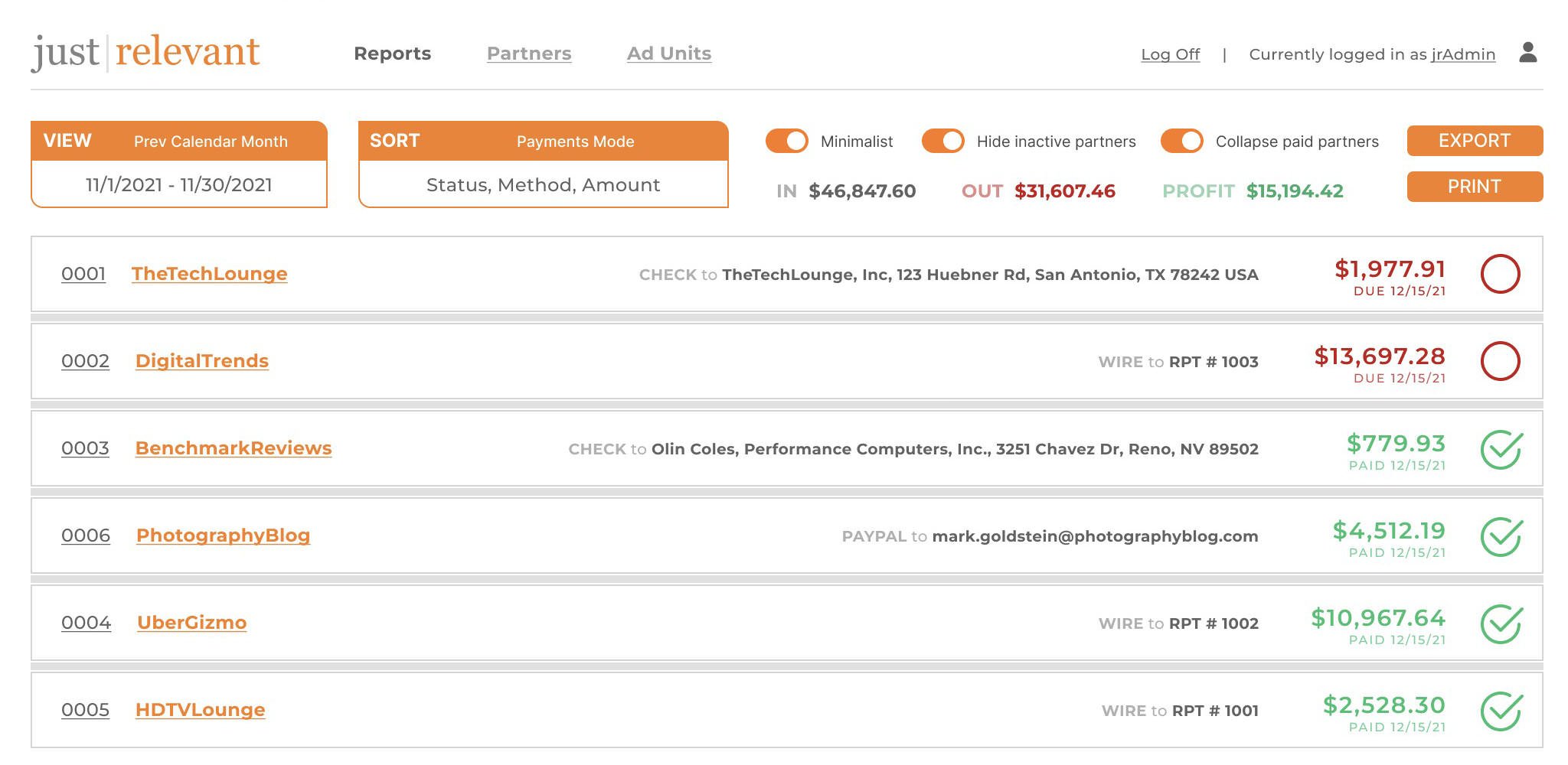
REPORTS - DEFAULT VIEW
Upon logging in as an administrator on JustRelevant’s website, the first thing you see is the Default View of the Reports page. The intention behind the design was to create something that gave a hawk’s-eye view of the business that could be viewed at the start of each day and bring attention to any matters which might necessitate internal or external discussion.

Feature Breakdown:
VIEW - Default view is “Last 30 Days” so that you can get a good idea of the average performance in relation to current performance. Clicking on the VIEW button brings up a modal where you can select from common options such as Previous Week/Month/Quarter/Year, Last 7/30/90/365 Days, or select a custom date range with calendar selection. After making your selection, all of the data and charts on the page will be updated in real-time.
SORT - Default sort is by “Alerts, Earnings, UserName”. Clicking on the SORT button allows you to select up to 3 of the following criteria in whichever order you prefer: Alerts, UserID, UserName, UserConversions, PaymentStatus, PaymentMethod, PaymentAmount.
Minimalist Toggle - OFF by default. There is a lot of information presented in the default view, but when it comes time to actually pay partners each month, for example, far less information is needed and it make it easier for the user when presented with less information. Overall earnings report is hidden, contact information is hidden and replaced with Payment Method and Payment Details, and all alerts and graphs are hidden.
Hide inactive partners Toggle - ON by default. At its peak, JustRelevant had over 80 international advertising partners, however over time some partners would become inactive. While at times it can be helpful to see which partners have recently become inactive, on a day-to-day basis it is preferable to minimize wasted space with empty graphs and $0 earnings.
Collapse paid partners Toggle - ON by default. The process of marking partners as paid is streamlined, but it is a manual process, so in practice we find it helpful to collapse a partners’ report upon marking it as paid by clicking the red circle which then turns into a green check mark.
EXPORT - This button allows the administrator to export a processed set of files, which is done on the 15th of each month for the month prior, in order to prepare for manual payment through various channels. PayPal offers a Mass Pay feature which accepts a comma-delimited file (.csv format) in order to greatly expedite PayPal payments. QuickBooks also offers a file import option so that you can print business checks and mailing envelopes. A PDF file is also exported as part of the batch, for printing and keeping a hard copy with records and tax documents.
Earnings & Profit Tables - Real-time, accurate reporting of total JustRelevant earnings from each upstream business partner, locally tracked real-time reporting of partner earnings, and the leftover Profit for the business. These are important metrics to ensure that any discrepancies in reporting are caught early. In some instances, an upstream partner would alter their tracking formulas or rate cards without informing JustRelevant first, which could result in decreased profits. If this were to happen, an alert would display to call attention to this.
Partner Reports - There is a LOT of information efficiently included in each individual partner reports. Starting at the very top, each component of this row are clickable.
The UserID links to the individual user’s page for adjusting their settings or generating code specific to their customized advertising integration. The UserName links to the partner’s website, for quickly opening a tab for quality control or technical support purposes. The UserContactName link starts a new e-mail to that partner. The UserTelephone link starts a digital phone call to that partner, and the UserLocalTime shows the administrator what time it is for the partner as a handy reference for whether it is an appropriate time to call them. The last item on the top line is the amount of earnings for the currently viewed period, along with a red circle button for PaymentStatus which is to be clicked after payment has been made, thereby transforming it into a green check mark.
Moving down to the next line we have some useful reference information about the partners’ unique visitors and page views per month along with a rolling average of their performance as measured in conversions (that is, number of clicks which convert to a purchase) - a very important metric in ensuring that we are providing merchants with quality traffic which in turns allows for very competitive rates to partners. Finally, Payment Method and Payment Details are shown below the amount, for quick reference when it is time to pay partners each month.
In the graph section we have an alert notification bar on the left next to the Y-label as well as a darkening of the affected part of the graph to indicate where attention is needed. The upstream partner, individually negotiated terms, clicks or impressions and total revenue is displayed above the graph. The graph itself visually creates a separation for each new week to help visualize any traffic patterns that may be associated with the day of the week. Hovering over any individual bar will display the exact performance for that day, but otherwise the view is kept simple and uncluttered. The average for the period shown (rounded to the nearest 10) is used as the middle line, the top line is doubled, and the bottom line is always 0.
REPORTS - MINIMALIST VIEW
Toggling Minimalist ON provides a far simplified view which is ideal for performing a very specific task such as processing payments on the 15th of each month for the month prior.
STANDARD AD UNITS
I designed a selection of ready-made ad units for publishers to choose from, with easily changeable options such as colors, borders, backgrounds, font choices, and more advanced customization possible via CSS. Some publishers used these stock designs with customized styles, but I personally designed custom integrations most partners.


FredMiranda’s forums are a very popular destination for photographers looking to read reviews and to buy or sell used equipment. Incorporating JustRelevant’s price comparison ads within the content with as much information as possible allowed a useful comparison of the value in savings of a used piece of equipment versus new with warranty from a licensed dealer.

To my knowledge, my ad design for Photo.net was the first time an image’s metadata was scanned in order to display price comparison ads for the equipment that was used to make a given photo in a gallery. Photographers loved the visual element of seeing what camera and lens was used while also having the link to buy it at their fingertips (their significant other may not have liked this so much).

Sound & Vision Magazine wanted something a little more discrete above-the-fold so a custom unit was designed simply showing the lowest price and the number of online retailers it was available from, with the bottom unit being a larger version showing the top-rated retailers and their prices.
LF Prints
Logo and web design.
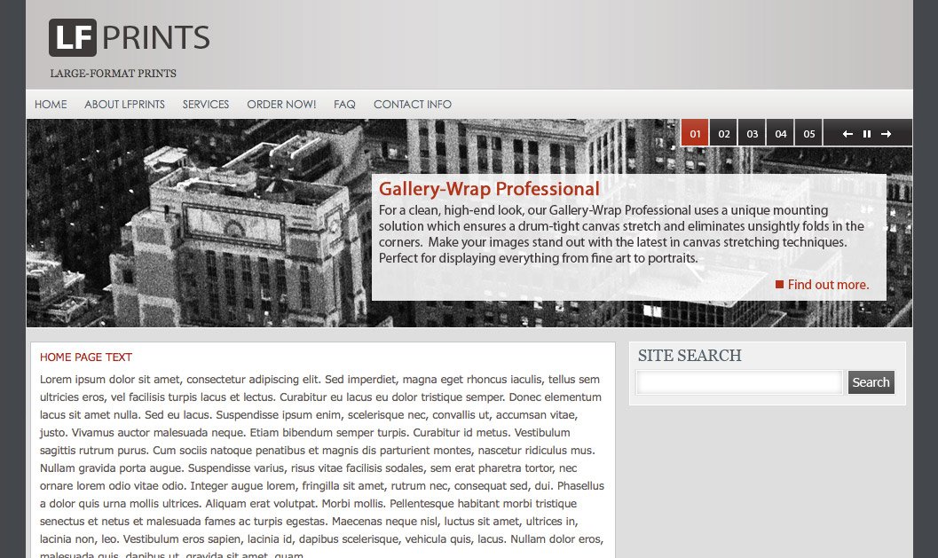
[2009] Web design created for boutique printing lab.
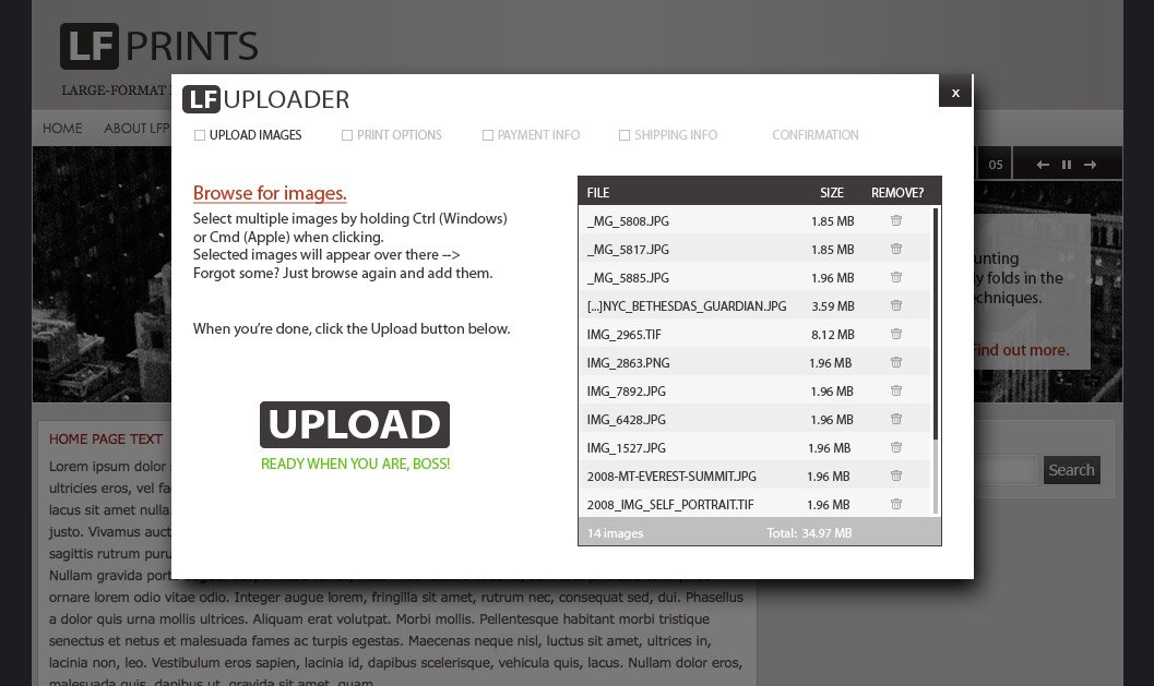
Design for the process of uploading images to LF Prints for ordering.

After uploading, client can select print size, paper type, special options, and can adjust crop if applicable.
TheTechLounge
Revamped web design for TheTechLounge.com with the goal of placing all content within a few clicks from the home page while letting the most recent / relevant content shine. Collaborated with another designer on the logo itself and created the rest of the elements myself. Color-coded content separators made it easier to find product reviews, editorial content and tech news, respectively.

[2008] A major theme in this update was SIMPLIFY. The previous design included too many images: editorial photos, product photos, advertisements… it was crowded and difficult to find what you want at a glance. By tabbing out the content it allowed us to pare down the number of images on-page at one time while still including industry standard ad sizes above the fold. This was a time when the industry started getting attention for possible conflicts of interest between publishers and advertisers, so elements were added to clearly differentiate paid advertisements. When hovering over ‘Recent Reviews’ and ‘Recent Articles’ titles on the right, the image and description would change to the corresponding article. This was before the ubiquitous touch screen web experience changed some design principles which would no longer be ideal. In a 2021 version of this design you would simply swipe between a larger graphic and everything would be in a responsive format.